My SO and I have gotten to a point in our lives where we’re financially secure enough to go on a bit of a Christmas shopping spree. Perhaps unsurprisingly, a lot of it ended up being for the kitchen – I got a food processor with the hopes of getting into curry paste and chimichurri somewhere down the line, and we picked up some proper wine glasses (finally!).
Then, out of seemingly nowhere, she picked out a long, rectangular tablecloth. Dyed a matte shade of tarmac grey, it looked for all intents and purposes like the landing strip of an airfield. “I have a hunch this will look good on the dinner table. What do you think?” I hesitated.
Our system has been simple. She buys pretty tableware, I fill them with pretty food. It has worked well so far. My SO’s not one to brag, but she’s proven herself to have a keen eye for aesthetics time and time again. She reigned as president of the Art Club back in high school, after all.

We human beings are visual creatures. A large part of our brains are devoted to processing information from our eyes, and sight is often the first sense with which we encounter something. We see our food before it gets in our mouth – we eat with our eyes first, especially now in the era of social media.
In fact, the more I cook, the more I realise that food that can be readily made in the home kitchen is sold at a premium in restaurants mostly because of a pleasing presentation. It follows that if one learns how to make food look good, one can enjoy a restaurant-quality experience for a home-cooked price.
We’ve had many successes in the past. The plates, the wooden trays, the utensils you see here on this site were all admitted into our kitchen by her discretion. One of my favourite items so far was a table mat in the form of a red leaf, which contrasts really well with the earth-tone organic material theme we have going on. But that had all been tableware. A tablecloth? That was something new. We returned home and laid it out with bated breath to see if it would work.
It was a hit. I could see the tablecloth will become a rising star in our future meals, a fixture that we will lay out with pride and joy on many special occasions to come. But that got me thinking – why exactly did it create such a striking visual appearance?
Permutations

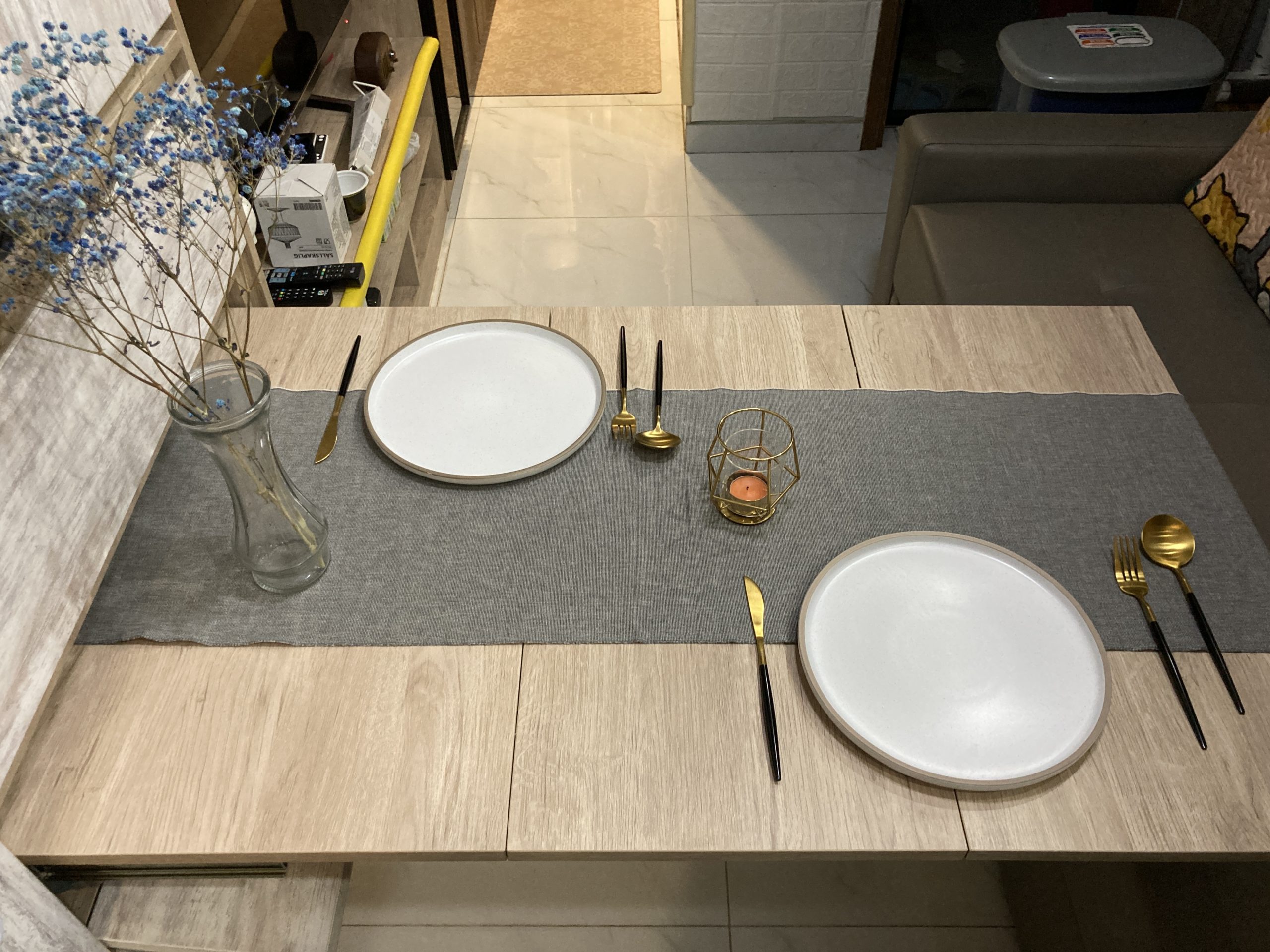
The picture above represents the height of fanciness that our dinner table could manage pre-tablecloth. Note the round plates which, while at first glance appears to be an unassuming white, is actually dotted with flecks of colour that give it a slightly heterogenous colour to serve as an un-intrusive background with some white noise. The shiny brass on the ends of the cutlery are balanced by their black handles.
While each individual component looks great on a close-up shot, I can’t help but feel like the table is looking a little bare in this wide shot (which cannot get any wider, my ass is already pressed up against the bathroom door).

Let’s now include the grey tablecloth. The visual difference is striking. Where there were once long stretches of bare wood, the tablecloth breaks up into smaller compartments. There is now two sides and a middle ground, divisions created by the negative space that the tablecloth leaves where it does not cover the table underneath. The matte grey colour creates a barrier between the two sections with visual contrast.

Here, visual contrast is taken to the next step with a candle holder and a vase of flowers. The brass fixings on the candle holder echoes that of the cutlery. The blue flowers add a splash of colour to the scene, and they’re complimentary to the orange of the candle wax.
Perhaps what’s most visually interesting with the two additions is that of adding variations in height. The vase was not put on the left by accident – it’s the side closest to the wall. There, the vase of flowers can create a gradient from which the eye can flow ‘downhill’ down to the candle and the plates, along the different elements of visual interest.

To further isolate the effects of the tablecloth, let’s now keep the vase and the candle but remove the tablecloth to see what happens.
Contrast in height alone does not a pretty scene make. The table is now lacking the backdrop that the tablecloth provided, and missing the visual interest that smattering of colour gave to break up the monotony of the table surface.
Here it is again side by side, where the differences are made more apparent.


Again, note how the vase and the candleholder adds visual contrast, but only in the presence of the tablecloth.
This was an interesting exploration. To summarise the lessons learned:
- Break up large areas of monotony
- Designate zones or areas with barriers
- Employ complimentary colours, but sparingly
- Create visual interest with variation in height
Now go read the post where I apply these principles to make a frugal dinner seem really fancy!


Keep browsing by categories, or by tags:
Beef Blog Broccoli Cabbage Carrots Cast iron Cheese Chicken Curry Dashi Date Night Dried scallops Dried shrimp Eggs Fish and seafood Garlic Ginger Glass noodles Gochujang Honey Miso Napa cabbage Onion Oven Pasta Pork Potatoes Salmon Sesame oil Shiitake mushrooms Shrimp Soup Sous Vide Steaming Stewing Stir fry String beans Sweet potatoes Teriyaki Tofu Tomatoes Vacuum cooker Vegetarian Yogurt Zucchini